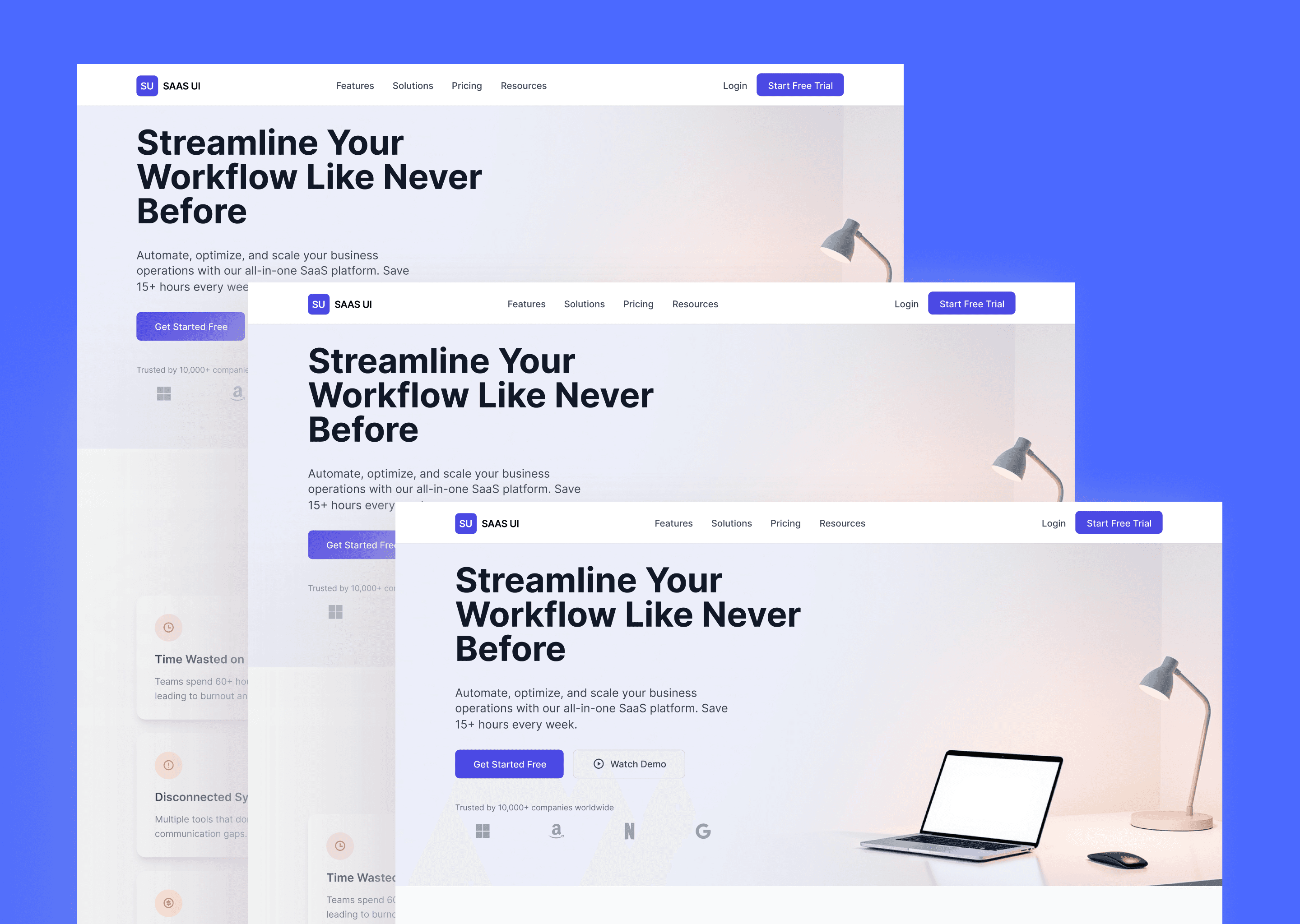
Workflow Automation SaaS Landing Page
I designed a clean and professional landing page for a SaaS platform offering workflow automation and team productivity solutions. The goal was to communicate the product’s value clearly and persuasively, highlight key features, and drive user sign-ups through an approachable and trustworthy design. and development of a mobile app to help users track their health metrics and maintain a healthy lifestyle. The app was designed to be user-friendly, visually appealing, and packed with features to support users in their health and wellness journey.
Challenge
✅ Clearly communicate the value proposition of workflow automation.
✅ Reduce high bounce rates caused by unclear content and poor structure.
✅ Build user trust through professional and approachable visuals.
✅ Create a seamless user journey that guides visitors to sign up.
✅ Ensure a clean, modern, and responsive design aligned with SaaS brand standards.
Results
The designed landing page delivered a clear, structured user journey, improved readability, and a modern aesthetic aligned with the SaaS brand. As a result:
✅ Average session duration increased by 35%.
✅ Bounce rate decreased by 28%.
✅ Conversion rates improved by 20% in the first month post-launch.
✅ Users praised the clean design and easy-to-follow content flow.
35%
Improved onboarding process
25%
Increase in user retention
84%
Increase in time spent on website
Process
Research & Analysis: We conducted user interviews, surveys, and analyzed in-app analytics to understand the pain points and user needs. We also studied competitor apps and industry trends to gather insights
Information Architecture: Based on the research findings, we restructured the app's navigation and content, prioritizing features and information according to user needs.
Wireframing & Prototyping: We designed low-fidelity wireframes to visualize the new layout and navigation, iteratively refining them based on user feedback. Afterward, we built a high-fidelity, interactive prototype to test the design.
Usability Testing: We conducted usability tests with a diverse group of users to validate the design and identify areas for improvement. Based on the feedback, we made necessary adjustments to the design.
Visual Design & Style Guide: We developed a cohesive visual language, including color schemes, typography, and iconography, ensuring consistency throughout the app. We also created a style guide to maintain design consistency in future updates.
“ With our new visual branding and language in place, the new Shopify brand clearly captures the essence of our current and target customer base, our employees, and our values. ”
Ejaz Karim
CEO, Co-founder | uConnect Technologies
Conclusion
The development of the mobile health tracking app demonstrated the importance of balancing functionality and usability in app design. By focusing on creating an intuitive and engaging user experience, we were able to support users in achieving their health goals and maintaining a healthier lifestyle. The app's success underscores the value of thoughtful design and user-centric development in the health and wellness industry.
